Monday, November 3, 2008
Monday, October 13, 2008
Assignment 2


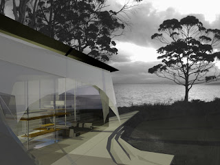
I thought I'd take the opportunity to add some comments about my work that I didn't get a chance to say in studio yesterday - hopefully this doesn't come too late for marking... (Probably before reading this, though, it would make more sense to first read the text on my presentation, which goes through my main ideas.)
Sequence and movement: the entry and movement around the house was carefully considered - particularly the entry. On arrival, the car would be parked behind the southern wall of the house, and the entry is on the eastern side of the house. When walking in, it is unclear which way to go, left or right of the bookcase wall - but the presence of the two cones and the elliptical negative space between them leads to the light and to the north. I wanted to create compression and a dramatic sense of tension on entry, and then freedom on moving further into the house. The way that one would move inside the house is inspired by a playground - it is not restricted to one plane and visual connections between upper and lower and maintained in almost the entire house. This is to hopefully create an enhanced feeling of physical activity and play - walking is not the only mode of transport: climbing and weaving are as well, and perhaps the occupants would find new ways of getting around and up to the platforms on the upper level.
Exploration/interactivity: This is linked to the above, but a bit different... I wanted the house to facilitate exploration and discovery, both inside and in its surrounds. In the house, it is not immediately clear what is where, particularly in the bookcase-wall. The kitchen and study, for example, would be within the bookcase, but behind folding cupboard-like doors, and each object in its place would need to be discovered (a bit like an advent calender!). The bed platforms are entered through the wardrobe hanging space (within the bookcase wall as well) and privacy is adjusted by the amount and kind of things that are stored in the shelving around the bed. Connections to the outside are also established to encourage exploration; there are two lookouts, one at the top of the reading cone, and one at the end of the deck-finger that reaches out to the west. Using these lookouts, the inhabitants can anticipate the conditions outside and make plans about their activities for the day.
Things that I need to develop:
Outer skin: In the drawings and model I have presented there it isn't clear what I intend to do with the north, east and west facades. I don't think it's feasible, given the climate, to just glaze these three surfaces, and I envisage them as a combination of glass, danpalon, and tent-like fabric skins at the moment. This is something that I am still designing...
Cone-interiors: These, particularly the bathroom, need to be firmed-up... The bathroom (with rainwater possibly running through somehow) will be tricky but I have thought about it a lot, and have some ideas... Structurally the idea is that I continue the floor surface up the outside of the reading cone and the roof cladding onto the inside of the bathroom to establish a continuity of floor/roof in both cases.
I'm sure there are a lot more...!
Thursday, August 28, 2008
WEAVING


Potentials Submission
Part 4 of 4
My final process was weaving. I elongated my module and sliced off the flat side of it, and then laid copies along side each other so that some parts of each were 'spooned' by the others (I think they look quite a lot like spoons actually...). I think it looks quite dynamic and exciting - like a rush of blood or a swish of fabric. Rather than interpret this as a space within my house, I think I might adopt these shapes, loosely, into the spatial layout of the house.
PACKING


 Potentials Submission
Part 3 of 4
After repeating and tesselating my module in different planes, I then layered these planes together so that each plane interlocked with the next (this is shown in the first two images). While experimenting with the opacity of the materials, I found that delicate patterns were created when the modules were quite transparent. The patterns created have depth but are also geometric graphics and in that sense are quite two dimensional. Amongst the shadows, there are repeating curved elements that resemble the undulations in the site's contour lines. The final image shows how these relate. I think that I will use these images as section cuts or plan images, and extract some of the shapes and layers into my designs that follow.
Subscribe to:
Posts (Atom)


